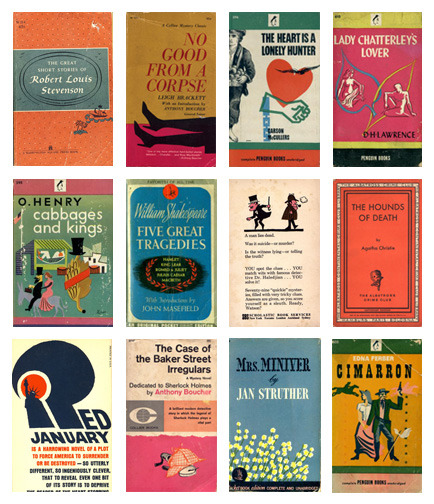
Despite the old adage, we do all judge books by their covers. After all, that’s what a cover is for, at least these days – it gives you a quick visual shorthand for what the book might be about. There’s established tropes, and we all recognize them:
Stars + rockets = space opera
Rear view of girl + big weapon = urban fantasy
Sad girl in pretty dress = YA of some flavour
All text, no image = literary fiction
Fuzzed image of suburban setting with massive text treatment = literary fiction, probably of the “depressingly awful people doing awful things” sort
And so on. There are covers that break these molds, obviously, and covers that elevate their basic tropes to something fabulous. But regardless of whether they’re strikingly fresh or clichéd or what-have-you, covers matter.
Yes, even in the Digital Age. Because these days, a lot of people do their book shopping online, and what’s the first thing you see? A thumbnail image of the book’s cover.
That cover is your first impression, the book’s first chance to reel you in. It needs to be right.
I’ve been thinking a lot about this lately, as Candlemark & Gleam is in the thick of a cover-design spree. We’re finalizing one cover, getting sketches in on two others, and working on thirty thousand variations of a fourth, trying to get an image that’s exactly right for the book. Oh, and we just contacted another artist about a fifth book that we’d like to get him to paint a cover for. Busy times, and lots of visual thinking going on.
It can take a lot of work to get a cover that’s exactly right for a book. Sometimes, it comes together like magic – Chris Sobolowski knocked it out of the park on his first swing with the cover for Green Light Delivery, for instance, as did Rio Griffiths with Erekos – and sometimes it takes an insane amount of revision and back-and-forth before the right cover materializes (A Series of Ordinary Adventures, I’m looking at you). But in the end, it’s worth it – because that just-right cover shows readers what to expect, and makes them want to pick up the book.
Get a cover wrong, and it’s just painful.
Witness:
This one has been making the rounds, so you’ve probably already witnessed all its horrible “glory,” but…dear god. Who thought this was a good idea?! Did they ever READ Anne of Green Gables? I’m guessing no.
And then there’s the trainwreck of a self-published book I attempted to read recently. I’m not actually going to link to the book here, because I feel really, really bad about pointing out how utterly awful the product is when the author has clearly tried pretty hard. Unfortunately, that “tried pretty hard” apparently did not extend to hiring a professional cover designer, nor to hiring a professional editor for the book (it’s loaded with insanely detailed descriptions of mundane trivia, down to telling us what sort of hanger is used in the protagonist’s closet). But the cover’s the worst part. It’s obviously meant to be a logo for a product referred to in the book, a fantasy card game, but it’s a Paint-generated white and black ring on white, overlaid with a bad shadow effect and then hit up with a heavy dose of Papyrus font. Tells you almost nothing about the book, and looks cheap and generic.
I actually picked up the ARC because of the bad cover, to see if “judging a book by its cover” was a bad instinct in this case. Sadly, it really does indicate a lack of attention to production value on the author’s part.
Which is a pity. Good cover design doesn’t have to cost a fortune – yes, hiring a professional illustrator or painter will run you a pretty penny, but there are artists out there who will work for an affordable rate, and even that pretty penny is going to pay off in terms of attracting readers, making the book look professional, and just plain creating the best book you possibly can. Whether you’re a DIY author, working with a small press, or working with a huge conglomerate publisher, shouldn’t that be your goal? To produce the absolute best book you can, in every way?
The cover is a major part of that. Don’t overlook it, and don’t settle for anything other than right.

