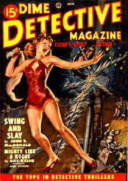
As we prep for the publication of City of Devils, we’re doing a couple of unusual things. One is getting illustrations and extras ready.
Yes, you read that right. Illustrations and extras. Now, a number of our books have interesting little gems tucked in – special chapter-break graphics in many, for instance, or a little flipbook Easter egg in the print version of I, Crimsonstreak (or the appendices in the back of that novel). Maybe the glossary and orbital information in Debris Dreams.
But we’re going a little wild with City of Devils, because Justin went a little wild with it. He didn’t just write extras; he wrote in-world extras for the book. As in, period-style pulp extras, like you’d find in a pulp novel from the 50s. To do justice to his in-world advertising, Don-Draper-as-monster style, we’ve been hitting up the visual references, like these pulp novel covers. And this vintage Oldsmobile ad.
With funky, fantastic things like this to pull from, how can it not be a great book?
(of course, some of the references we’ve been looking at are traumatizing. Ads in the 50s were…interesting…)
And guess what? If you pre-order, you can get things like special-edition trading card packs featuring some of the character illustrations, done by Fernando Caire!
What more incentive do you need, hmmm?


Okay, some of those ads were actually hilarious. Like, meant to be funny and actually funny. I kind of feel like the article writer was trying too hard. Esp. when he/she suggested jewelry would be a better present than a Hoover. (But yes. I have various of the Lileks books and yeah…)
The wifeskin rug was just CREEPY. But some of the others were seriously hilarious. Ah well…
I’m not sure which ad makes me cringe most. Possibly the Lysol one, although
Mornidine may have had some worrying side-effects too.